No products in the cart.
Pantone colors are a crucial element of any design, printing, or branding exercise. The Pantone system is used across the industry by designers and printers to ensure consistency in color reproduction, allowing for accurate color representation across different media. In this post, we’ll take a closer look at what Pantone colors are, how they’re used, and why they’re so essential.
What are Pantone Colors?
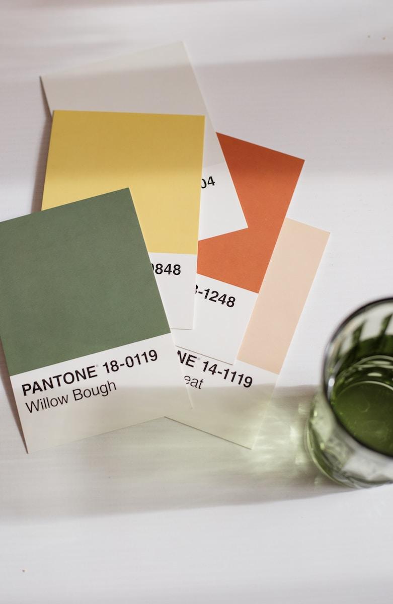
Pantone colors are standardized colors that are widely used in the design, printing, and fashion industries. The Pantone Color Matching System, or PMS, is a standardized color reproduction system that allows designers and printers to accurately reproduce colors across different media. Pantone colors use a numerical designation to identify and match specific colors, making it easy to communicate and reproduce consistent colors across different materials.
How are Pantone Colors Used?
Pantone colors are mostly used in printing, where consistency is essential for brand recognition and brand continuity. Pantone colors are used as spot colors, which means that they’re printed using one ink color rather than multiple ink colors that are blended together during the printing process. This ensures that the color remains consistent and uniform across different print materials, even when printed on different paper types or with different printing methods.
Why are Pantone Colors Essential?
Pantone colors are essential for branding and consistency in design. Inconsistent colors can harm a brand’s reputation, making it hard for customers to recognize and engage with the brand. With Pantone colors, designers and printers can ensure that each color is consistent across different media, solidifying the brand’s visual identity.
How to Choose Pantone Colors?
Choosing Pantone colors can be a daunting task, but there are a few things to consider when making your selection. First, make sure to take into account the final printing method and materials, as different papers and printing methods can affect color reproduction. Second, consider the audience and the emotional message of the brand, as each color has a psychological impact on viewers. And finally, consider using a Pantone color swatch book or working with a professional designer to ensure accurate color representation.
Pantone colors are essential for designers and printers seeking consistency, accuracy, and reliability in color reproduction. By using standardized colors, designers and printers can achieve brand recognition, create clear visual identities, and ensure that each color remains consistent across different media. In choosing Pantone colors, it’s essential to consider the final printing method and materials, the audience, and the emotional message of the brand. Whether you’re a designer, a printer, or a business owner, Pantone colors are an essential tool for creating a powerful, consistent, and recognizable brand identity.


Related posts

After seven years of dedication to providing high-quality printing services and personalized gifts, PrintVolution is proud to unveil a brand-new website that reflects the company’s... Continue reading

Let’s face it: gift-giving can sometimes feel like trying to find a needle in a haystack. What do you get for the person who has... Continue reading

Ah, the joy of gift-giving! There’s something magical about watching someone’s face light up as they unbox a carefully chosen treasure. But wait, let’s crank... Continue reading

Thoughtful Touches: The Magical World of Personalized Gifts That Dazzle Hello, fabulous gift-givers! 🎁 Are you ready to elevate your gifting game from “just okay”... Continue reading