Poster Printing in Singapore: How to Get Posters That Actually Get Noticed
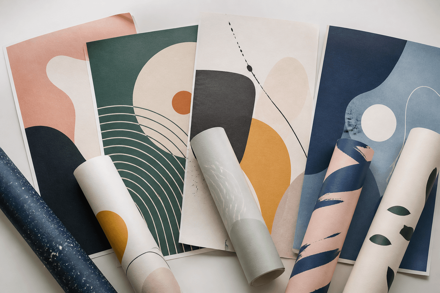
A poster has one job: to make someone stop, look, and remember. Whether it is an event backdrop, a shopfront promo, a class timetable on a wall or artwork for a café, the difference between a poster that gets ignored and one that pulls a second glance usually comes down to a handful of small decisions made before anything is printed. This guide walks through poster printing in Singapore from a buyer's point of view — size, finish, file setup, placement and quantity — so the finished piece looks the way you pictured it, not a surprise you have to reprint.
None of this requires design-school knowledge. Get the sizing and the file right, choose a finish that suits where the poster will hang, and the rest takes care of itself.
Start With the Job, Not the Size
Before you think about millimetres, be clear on what the poster has to do. A poster read from across a hall needs a big headline and very little text. A poster read while someone waits in a queue can carry more detail — a menu, a schedule, a set of steps. A poster that is really a piece of wall art follows different rules again, where the image is the whole point and words barely feature.
Naming the job first saves money later. It tells you how large to go, how bold the type needs to be, and how much can realistically fit before the design turns into a wall of text nobody reads. As a rule of thumb: the further away your reader stands, the fewer words your poster should carry and the larger everything on it should be.
Choosing the Right Poster Size
Singapore print sizing follows the international ISO A-series, which keeps things simple because each size is exactly half the one above it. The common poster sizes are:
- A3 — 297 × 420 mm. Great for indoor notices, lift-lobby posters and table-side displays.
- A2 — 420 × 594 mm. The workhorse size for shopfront promos and event signage.
- A1 — 594 × 841 mm. Reads well from a few metres away; ideal for exhibitions and roadshows.
- A0 — 841 × 1189 mm. A statement piece for launches, backdrops and large walls.
If you are unsure, go one size up rather than down. Posters almost always look smaller on a wall than they do on your screen, and a slightly larger poster reads more confidently from a distance. When you configure your order on the poster printing in Singapore product page, the live calculator lets you set the size and see your options so you can match the format to the space.
Poster Printing Prices in Singapore
Poster printing here is priced per piece, so you can order a single poster or a short run at the same flat rate — there is no minimum quantity to unlock a price. Full-colour printing on poster paper or poster sticker media costs the same:
| Size | Dimensions | Price per piece |
|---|---|---|
| A3 | 297 × 420 mm | S$8 |
| A2 | 420 × 594 mm | S$11 |
| A1 | 594 × 841 mm | S$18 |
| A0 | 841 × 1189 mm | S$28 |
Add-ons are priced per piece by size: matt or gloss lamination from S$4, foam-board mounting from S$3, and options like kapaline board, die-cutting, capping and even a cardboard standee are all in the configurator. The poster printing price calculator totals your exact combination as you build it, so there are no surprises at checkout.
Matte or Gloss? Picking a Finish
Finish changes how a poster feels and how it behaves under light. There is no universally "better" option — it depends on where the poster lives.
Gloss makes colours pop and blacks look deep, which suits photography, food shots and vibrant product imagery. The trade-off is reflection: under bright downlights or near a window, glare can wash out parts of the design and make text harder to read at an angle.
Matte has a flat, non-reflective surface that stays readable from every angle and photographs cleanly under harsh lighting. It is the safer pick for text-heavy posters, information boards and anywhere lighting is unpredictable. Colours look a touch more muted than gloss, but the readability is worth it in most retail and event settings.
If the poster is mostly image and it will sit somewhere with soft, even light, gloss rewards you. If it carries a lot of type or hangs under spotlights, matte is the more forgiving choice.
Getting Your File Print-Ready
This is the step that quietly decides whether your poster looks sharp or soft, and it is the most common thing people get wrong. Three things matter:
- Resolution. Supply artwork at print-ready quality — 300 DPI at the final printed size. A file that looks crisp on a phone screen can turn blurry once it is blown up to A1 or A0, because screen images carry far less detail than print needs. Always design at, or scaled to, the actual poster dimensions.
- Colour mode. Print reproduces colour using CMYK inks — cyan, magenta, yellow and black. Screens use RGB light, which can display shades that ink cannot reproduce exactly. Building or exporting your file in CMYK keeps what you see closer to what you get, especially for strong brand colours.
- Bleed and margins. Add 2 mm of bleed on every edge — extra background that extends past the trim line — so a tiny shift during cutting never leaves a thin white strip along the border. Keep important text and logos a comfortable margin inside the edge so nothing gets clipped.
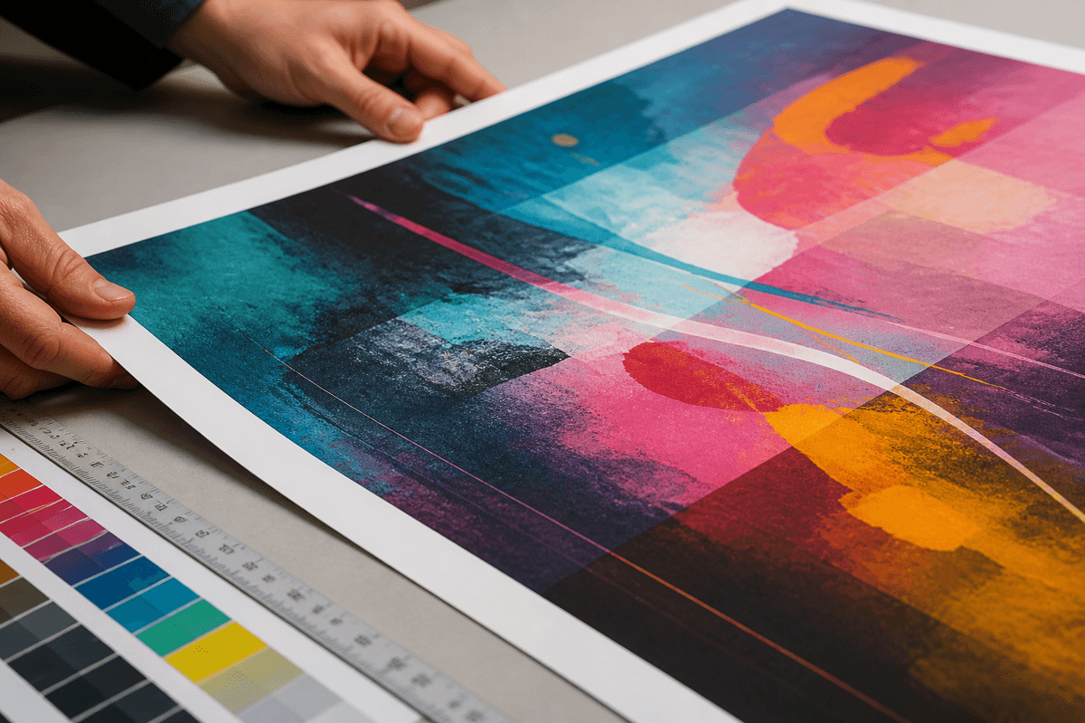
If you are working from a template or exporting from a design tool, most will let you set the document to the exact poster size, switch to CMYK and add bleed before you export a PDF. Do that once at the start and the file behaves for the rest of the project.
Indoor or Outdoor: Match the Material to the Spot
Standard poster stock is designed for indoor life — walls, boards, frames, windows and event displays. It handles Singapore's air-conditioned interiors beautifully and looks premium in a frame or mounted flat.
Outdoors is a different world. Direct sun, humidity and the odd afternoon downpour are hard on paper. If a design needs to live outside for more than a day or two, a weather-tougher signage material is the better call rather than expecting a paper poster to survive the elements. Decide indoor-versus-outdoor early, because it affects both the material you choose and how you design — outdoor pieces usually need bolder type and higher contrast to read in bright daylight.
How Many Posters to Print — and Where to Place Them
Quantity is really a placement question. Walk the space and count the spots where a poster would genuinely be seen: the entrance, the queue line, the lift lobby, the noticeboard, the window facing foot traffic. Each of those is one poster. Then add a couple of spares — corners lift, tape fails, and it is always cheaper to have one extra on hand than to reorder for a single wall.
For events and roadshows, think in sightlines rather than square metres. A handful of well-placed A1 posters at eye level will out-perform a dozen small ones scattered where no one looks. Placement beats volume almost every time: one poster in the right spot does more work than five in the wrong ones.
One related note: if the display needs to stand on its own at an event — no wall, no easel — a roll up banner from S$75 with the retractable stand included often does the job a taped-up poster cannot. Our roll-up banner printing guide covers the sizes and setup.
Common Poster Printing Mistakes to Avoid
- Low-resolution images. The number-one cause of a soft, disappointing poster. Never scale a small image up to fill a large format.
- Too much text. A poster is a headline, not a brochure. If the reader has to walk closer to finish reading, it is doing the wrong job.
- Ignoring viewing distance. Design for how far away people will actually stand, and size your type accordingly.
- Skipping bleed. No bleed means a real risk of thin white edges after trimming.
- Forgetting the finish decision. Choosing gloss for a text-heavy poster under spotlights is a readability trap. Match finish to lighting.
Frequently Asked Questions
What is the most popular poster size in Singapore?
A2 (420 × 594 mm) is the everyday favourite for shopfronts and events because it is large enough to read across a room yet easy to frame and handle. A1 steps up when you need presence from a few metres back.
Should I choose matte or gloss for my poster?
Choose matte for text-heavy posters or anywhere lighting is bright and unpredictable, since it stays glare-free and readable from every angle. Choose gloss when the poster is image-led and sits in soft, even light, because it makes colours and contrast pop.
What resolution do I need for a poster?
Aim for print-ready artwork at 300 DPI at the final printed size. Design at the real poster dimensions rather than blowing up a small image, which keeps everything crisp even at A1 and A0.
Can I use a poster outdoors?
Standard poster stock is built for indoor display. For anything that has to withstand sun, rain and humidity over time, a dedicated outdoor signage material is the more sensible choice.
Do I need to add bleed to my file?
Yes — add 2 mm of bleed on every edge and keep key text safely inside the margin. It protects your design from thin white slivers if the cut shifts slightly.
How much does poster printing cost in Singapore?
Full-colour poster printing costs S$8 for A3, S$11 for A2, S$18 for A1 and S$28 for A0, per piece, on poster paper or poster sticker media. Lamination adds from S$4 per piece and foam-board mounting from S$3, depending on size.
Can I print just one poster?
Yes. Posters are priced per piece with no minimum run, so a single A2 poster costs S$11 — useful for one-off frames, event signage and test prints before a bigger batch.
How fast can I get a poster printed?
Express turnaround is available on request — message us on WhatsApp with your deadline. You can collect at Paya Lebar Square or have posters delivered island-wide.
Ready to Print
Good poster printing in Singapore is less about fancy tricks and more about a few deliberate choices: pick a size that suits the viewing distance, choose a finish that matches the lighting, and hand over a print-ready CMYK file with bleed. Get those right and the poster on the wall looks exactly like the one in your head. When you are ready to set sizes and finishes and see it come together, start on the poster printing page and build your order around where it is going to hang.
This article is part of our full guide to printing services in Singapore — prices, turnaround times and how to choose a print shop.