Matte or Gloss Poster? A Guide to Poster Lamination in Singapore
Should you print posters glossy or matte? For most posters in Singapore the answer is matte — it kills the glare from ceiling downlights and keeps text readable from a metre away — while gloss earns its place on photo-led artwork that needs colour to punch. Either way, lamination is a single step on our poster printing page, so you can build the poster, switch the finish and see the difference reflected before you order.
This guide walks through what lamination actually does, where each finish wins, and the other three decisions — size, media and mounting — that sit alongside it when you order poster printing in Singapore.
What poster lamination actually is
Lamination is a thin transparent film bonded over the printed sheet after printing. It is not a coating sprayed on, and it is not something your design file controls — it is a finishing choice made at production. That film does three jobs: it protects the ink from fingerprints, scuffs and moisture, it stiffens a large sheet so it hangs flatter, and it changes how light behaves when it hits the surface.
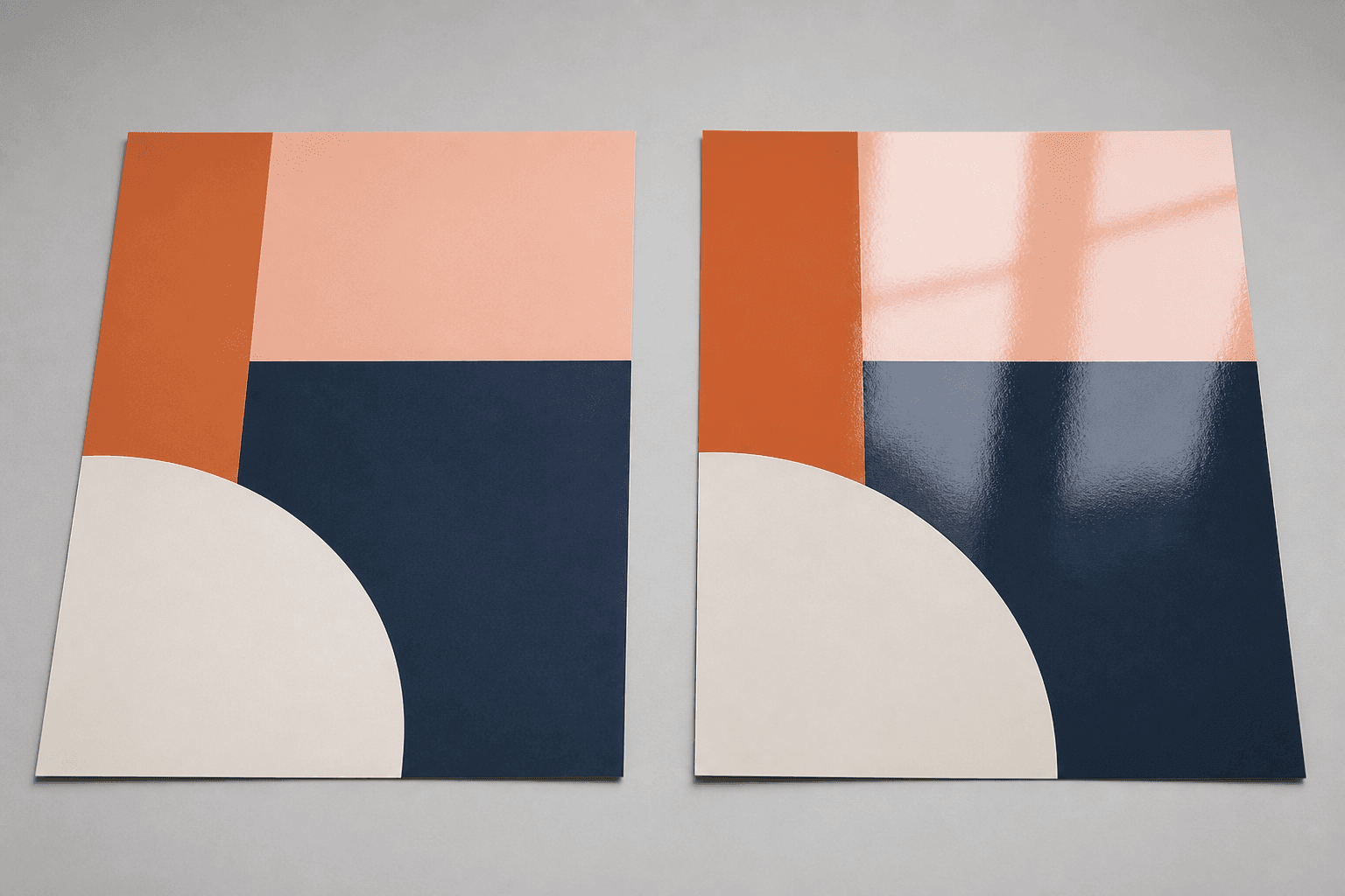
That last job is the one people actually notice. A matt film scatters incoming light in every direction, so the surface looks even from any angle. A gloss film reflects light like a mirror, so colours look deeper and darker — and so do the ceiling lights, if they happen to be behind the viewer.
On our posters the choice is presented plainly: matt lamination, gloss lamination, or no lamination at all for a plain paper poster. Nothing about your artwork changes between the three — the same print-ready file produces all of them.
Matte lamination: where it wins
Matte is the safer default, and in a Singapore context it wins more often than people expect. Almost every retail unit, office lobby, clinic, classroom and event hall here runs bright ceiling lighting, often LED downlights in rows. Those lights are exactly what a glossy surface reflects straight back into a reader's eyes.
Pick matte lamination when:
- The poster has text people need to read. Menus, price lists, event schedules, safety notices, class timetables — anything scanned at reading distance.
- The poster hangs under strong or direct light. Shopfront windows, lift lobbies, exhibition halls with spot lighting.
- The design is flat colour, illustration or type-led. Vector artwork, bold blocks of colour and clean typography look crisp and modern on matte; they gain nothing from gloss.
- People will stand close to it. Matte hides fingerprints and surface marks far better, which matters on a poster that gets handled during setup.
- You are photographing the space. Matte photographs cleanly without hotspots, which is why it is the usual pick for launches, showrooms and anything going onto social media.
The trade-off is honest: matte slightly mutes the deepest blacks and the most saturated colours. A dark navy on matte reads a shade lighter than the same navy on gloss. For most commercial posters that is a fair price for glare-free readability.
Gloss lamination: where it wins
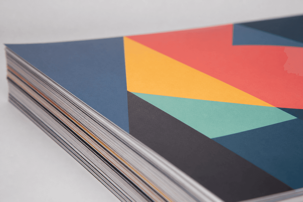
Gloss is not the lazy option — it is the right option for a specific kind of poster. The reflective film increases perceived contrast, so blacks look blacker and saturated colours look richer. Photographs in particular gain depth that matte cannot replicate.
Pick gloss lamination when:
- The poster is photography-led. Food shots, portraits, product photography, travel imagery, film-style key art.
- You want maximum colour impact at a distance. A gloss poster read from across a hall pulls the eye harder than a matte one.
- The artwork is dark or high-contrast. Deep backgrounds and night scenes come alive on gloss and can look slightly flat on matte.
- The lighting is soft, indirect or under your control. Cafés, restaurants, studios, retail interiors with warm side lighting — anywhere the reflection lands away from the viewer.
- The poster will be wiped down. Gloss cleans easily and shows moisture marks less than an unlaminated sheet.
The trade-off is glare, and it is not subtle in a brightly lit room. If you cannot control the lighting where the poster hangs, gloss is a gamble; matte is not.
Matte vs gloss: the quick decision table
- Lots of body text? Matte.
- Photography as the hero? Gloss.
- Bright overhead lighting? Matte.
- Warm, controlled or dim lighting? Gloss.
- Read up close? Matte.
- Read from across the room? Gloss.
- Being photographed for social or press? Matte.
- Flat colour, illustration or typography? Matte.
- Not sure? Matte. It is the finish that fails gracefully — a matte poster in the wrong room is still perfectly readable, while a gloss poster in the wrong room can be unreadable from the one angle everyone stands at.
You do not have to commit before you see the options. Open the finish step on our posters, set your size, and both laminations sit side by side so you can compare what you are choosing.
What about skipping lamination entirely?
An unlaminated poster is a legitimate choice, not a downgrade. Bare paper has a natural, slightly textured look that suits art prints, gallery-style displays and anything with a deliberately understated feel. It is also the only version you can write on with a marker, which matters for classrooms, workshops and planning walls.
Skip lamination when the poster is short-lived, indoors, out of reach and unlikely to be handled — a one-week campaign poster in a controlled space, for example. Add lamination when the poster is going up and down repeatedly, travelling to an event, hanging somewhere humid, or expected to stay presentable for months. Singapore's humidity is genuinely a factor here: bare paper on an exterior corridor wall does not stay flat for long.
The other three decisions: size, media and mounting
Lamination is one of four choices on the poster page, and the other three shape the result just as much.
Size. Posters come in the standard ISO A-series: A3 (297×420mm) for table-top notices, counter displays and lift-lobby signage; A2 (420×594mm) as the everyday shopfront and noticeboard size; A1 (594×841mm) for event and exhibition posters meant to be read from several metres; and A0 (841×1189mm) when the poster needs to command a wall on its own. As a rough rule, step up one size for every few metres of viewing distance.
Media. You can print on standard poster paper, or on poster sticker — an adhesive-backed material. Poster paper is what most people want: hang it, frame it, or clip it to a stand. Poster sticker is the one to pick when the print needs to be bonded to something rigid.
Mounting. When you choose poster sticker, mounting options open up. Compressed foam board gives you a light, rigid panel that stands or leans without a frame — the usual pick for event signage and photo walls. Black Kapaline board is the heavier, more premium panel with a dark core, so the edge reads as a clean black line rather than white foam. Mounted posters can also be die cut to a custom shape, finished with black or white edge capping, or built as a cardboard standee that stands up on its own.
Combining those sensibly is where a poster stops looking like a printout and starts looking like signage: a matte-laminated A1 on foam board with black capping is a very different object from an A1 sheet taped to a wall.
Getting your artwork right before you order
The finish cannot rescue a soft file, so get these right first:
- Supply print-ready artwork at 300 DPI at final size. A file that looks sharp on screen can still be soft when blown up to A0 — always check resolution at the size you are actually printing.
- Design in CMYK. Posters print with CMYK inks, so building and checking your file in CMYK avoids the surprise of a screen-bright RGB colour landing duller on paper.
- Add bleed and keep a safe margin. Extend any background colour or image past the trim edge, and keep text well inside it so nothing important sits near the cut.
- Size type for distance, not for your monitor. Headline text that looks huge zoomed-in on screen can be small on an A2 read from three metres away.
- Remember gloss deepens, matte softens. If your design is already very dark, gloss will push it darker still.
Frequently asked questions
Should I print posters glossy or matte?
Matte for text-heavy posters and brightly lit spaces; gloss for photo-led artwork in softer or controlled lighting. If you genuinely cannot decide, matte is the lower-risk choice because glare never becomes a problem.
Does lamination make a poster last longer?
Lamination adds a protective film over the ink, which shields it from fingerprints, scuffs and moisture that would mark a bare sheet. It also stiffens the poster, so it handles repeated hanging and transport better than unlaminated paper.
Can I write on a laminated poster?
Not with a normal pen or pencil — the film is not absorbent. If your poster needs to be written on, skip lamination.
Is matte or gloss more expensive?
The two finishes are costed separately and both scale with size, so the honest answer is to check them against each other on the poster page — the calculator there updates as you change size and finish.
What is the difference between poster paper and poster sticker?
Poster paper is a standard printed sheet you hang, frame or clip up. Poster sticker is adhesive-backed, which is what allows it to be mounted onto compressed foam board or black Kapaline board for a rigid, self-supporting display.
What poster size should I choose?
A3 (297×420mm) for close-range notices, A2 (420×594mm) for shopfronts and noticeboards, A1 (594×841mm) for events and exhibitions, and A0 (841×1189mm) when the poster needs to own the wall.
Build your poster with the finish you actually need
Matte or gloss is not a matter of taste so much as a matter of context: what is on the poster, and what the light is doing in the room where it hangs. Get those two right and the finish stops being a guess.
When you are ready, order your posters and set size, media, lamination and mounting step by step on the poster page — everything in this guide is a choice you make there, with the live calculator updating as you go.
Printing something for the same space? A photo that deserves to be an object rather than a sheet belongs on stretched artist canvas, and if the display needs to travel and be reused at every event after, a roll-up banner does the job a poster cannot.